Objective
General Electric Company is an American multinational conglomerate. For more than 125 years, GE has been recognized as trailblazers for reinventing the future of industry. Customers trust GE for their quality, innovation and sustainability. Every year GE releases its annual report to its employees and the public. This report is a comprehensive telling on GE’s activities throughout the preceding year. This fictitious design challenge was to take the text-heavy document and redesign it to make it easier for readers to comprehend. This tactic of creating a more digestible annual report will further GE’s transparency and secure more customer loyalty.
Overview
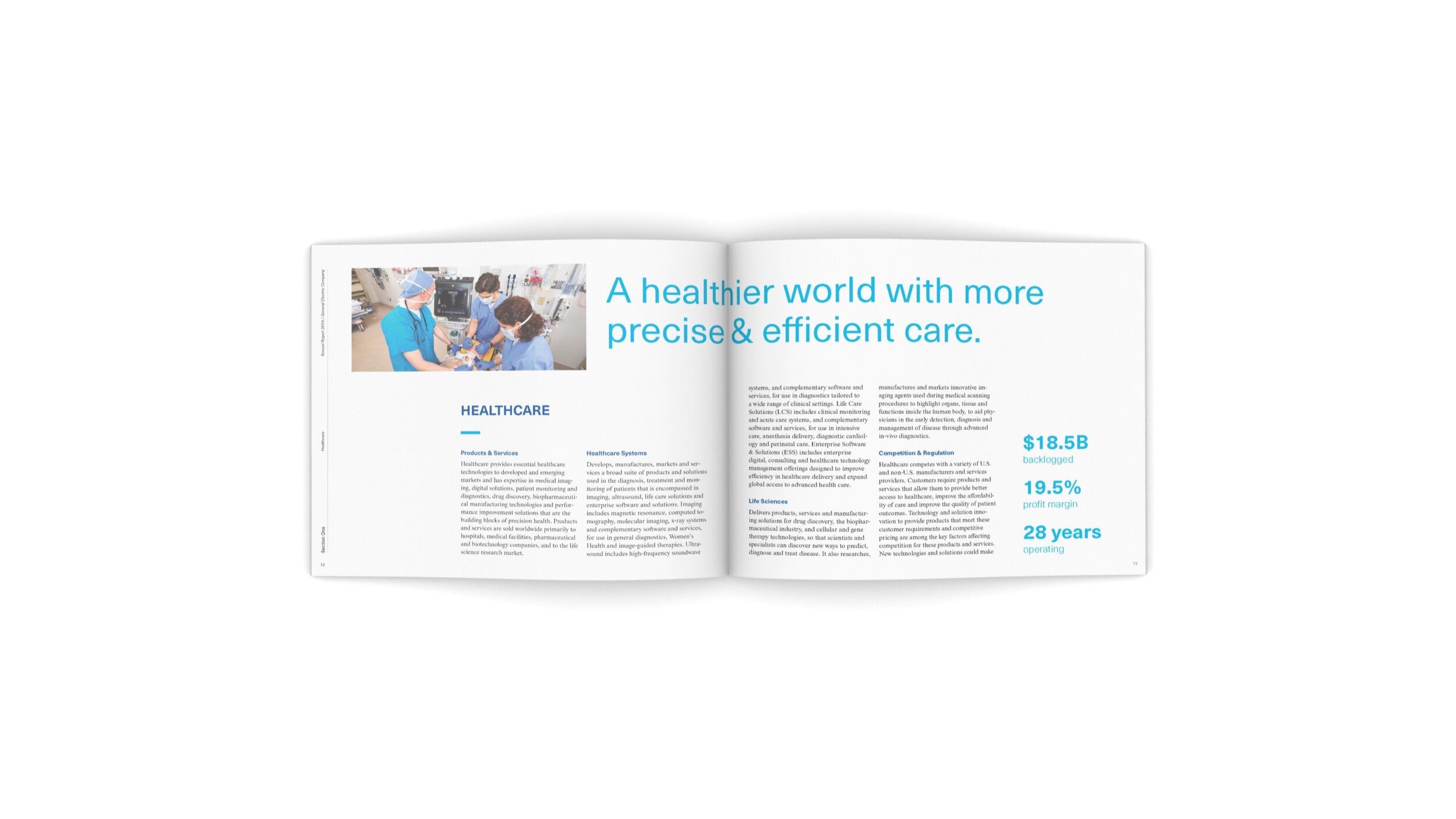
A clean design approach that utilizes a grid system is seen throughout the annual report. Neue Hass Grotesk, a sans serif typeface, is used for all headings and subheadings. This type choice makes the report feel contemporary and relevant. The color palette is monochromatic, using the cobalt blue that GE is so widely recognized for as the primary color. A blue duotone photography treatment is used for segment introductory spreads. This works as a visual cue to the reader that they are now moving on to a new section. Dense information was broken down into infographic spreads to make statistics more accessible for the reader. These design decisions make GE’s annual report both visually interesting and user-friendly.