
Objective
Symphony SF is a world-renowned music institution in San Francisco, California. The organization hosts weekly concerts, provides music education for the youth of the community and seeks to make classical music accessible to all. Symphony SF currently attracts a demographic that is upper middle class, aged between 50 and 65 years old. The people of this demographic are attracted to the arts and are eager to contribute their income to like-minded institutions. However, Symphony SF seeks to attract a more youthful audience that is passionate about preserving classical music for generations to come. This desired result called for a fictitious re-brand that would ultimately work as a visual conversation between Symphony SF and future symphony attendees.
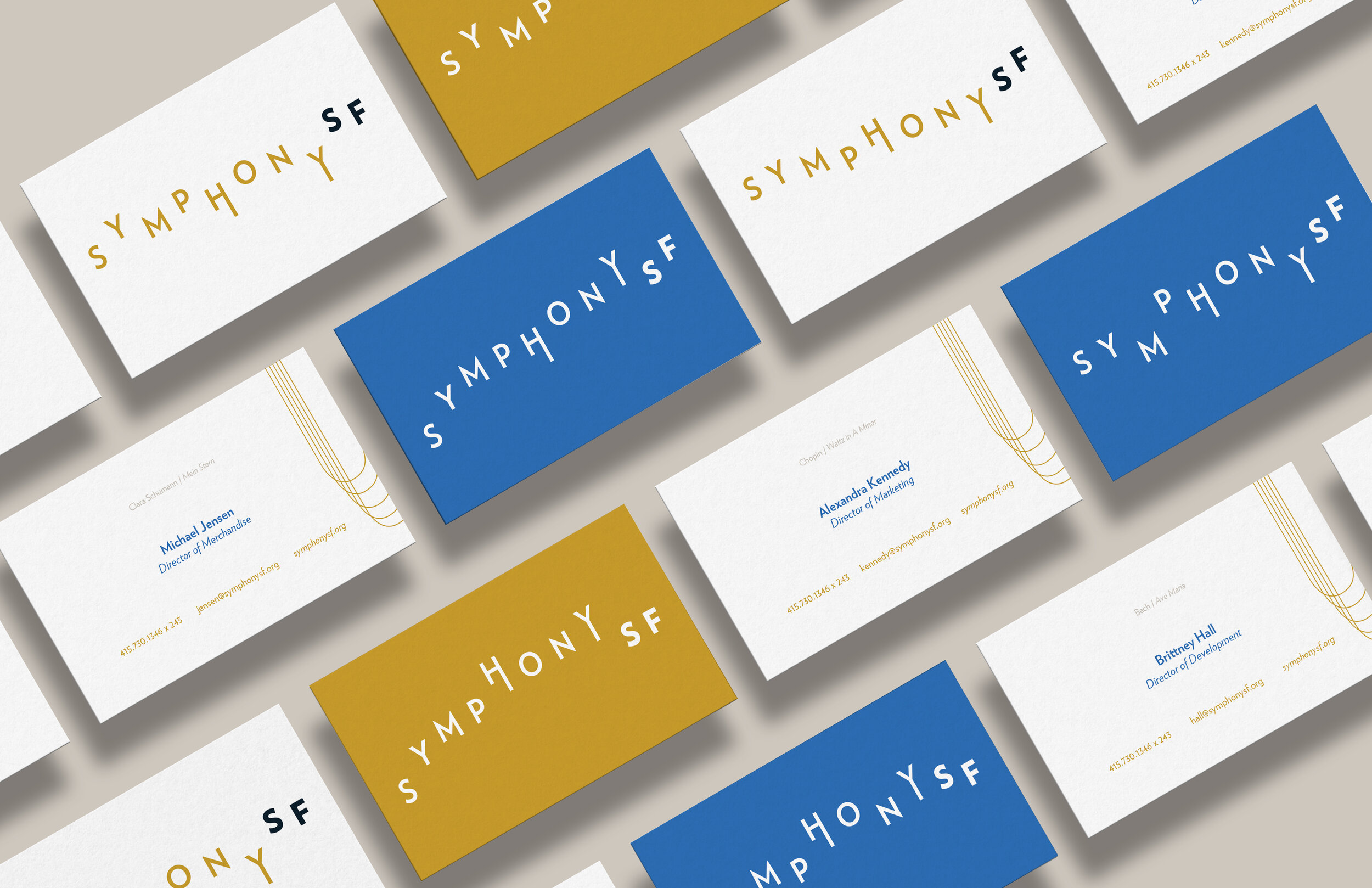
Overview
A modern and energetic design approach is seen throughout the rebrand of Symphony SF. The dynamic logo needed a typeface that would maintain a sense of sophistication despite modifications and continual baseline shifting. With these type requirements in mind, Verlag, a geometric sans serif typeface, was selected for its clean lines yet approachable appearance. Dijon yellow, cloud gray, midnight and azure blue were selected to create a rich color palette that reminisces paintings of composers from the past. The voice of the re-brand is approachable and engaging, speaking to a younger audience. These design decisions make Symphony SF relevant in the contemporary world and help to keep the art of classical music from becoming a thing of the past.

BIG IDEA
In order to boost relevancy and attract a younger demographic, Symphony SF needed a big idea. The task would be to create a short statement that fused together what the symphony is and what the symphony aims to do.
Understanding
Three other world-renowned symphonies were analyzed: The New York Philharmonics, Seattle Symphony and Chicago Symphony Orchestra. Thus showing the passion behind classic music and the desire to preserve it for future generations.
Simplicity & Focus
Symphony SF has core values that share a theme of human connection, thus the focus would be how music has the ability to heighten people’s senses. The goal was to attract like-minded music enthusiasts to Symphony SF.
Positioning
To differentiate Symphony SF, the decision was to position the institution as the forefront of keeping classical music alive and making the symphony accessible to all while harnessing both the tradition of the symphony and cultural changes.
Brand Essence
The key messages, voice and tone of communications encompass the notion that enjoying the sound of the symphony play live is not just for an elite older demographic, but for anyone who enjoys listening to music.
BIG IDEA
Vision By Sound.